The Le Lab Branding Journey: From Concept to Cone

I recently had the opportunity to develop the brand identity for Le Lab, a new artisanal ice cream shop opening in Belgium. The owner wanted to convey a sense of homemade quality and experimentation, while also feeling approachable and fun.

lelab1

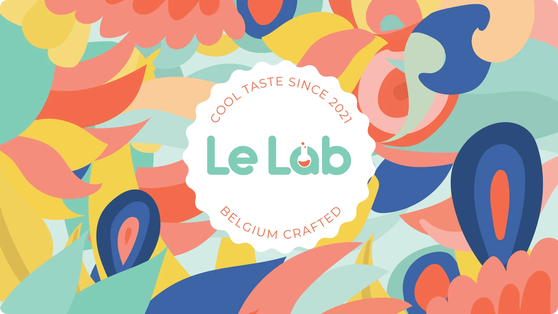
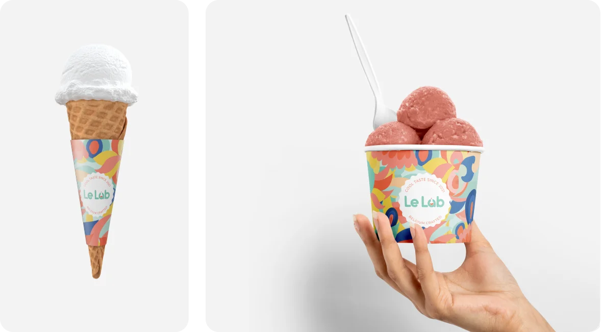
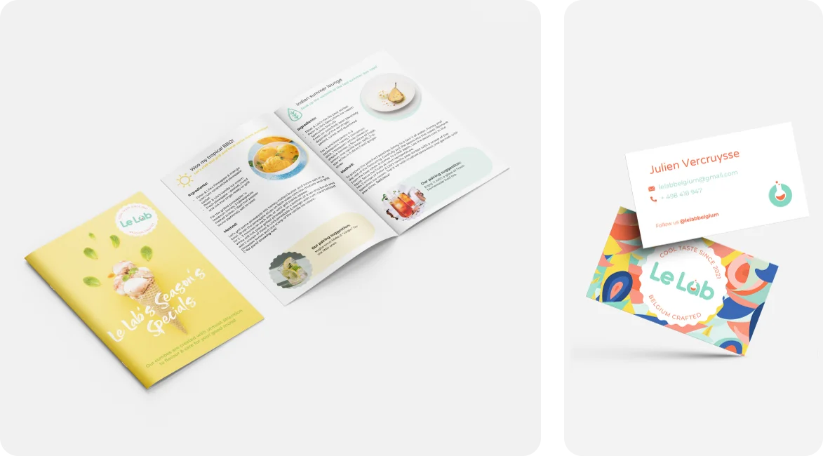
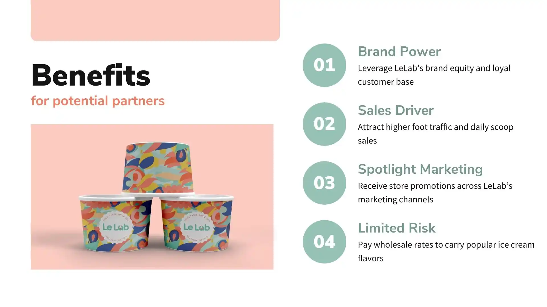
The color palette centers around shades of blue, green, yellow and peach to evoke refreshing ice cream flavors. Bold natural shape graphics pattern is used adorn the branding materials, including the recipe menu, business cards, and ice cream cups.

picture2

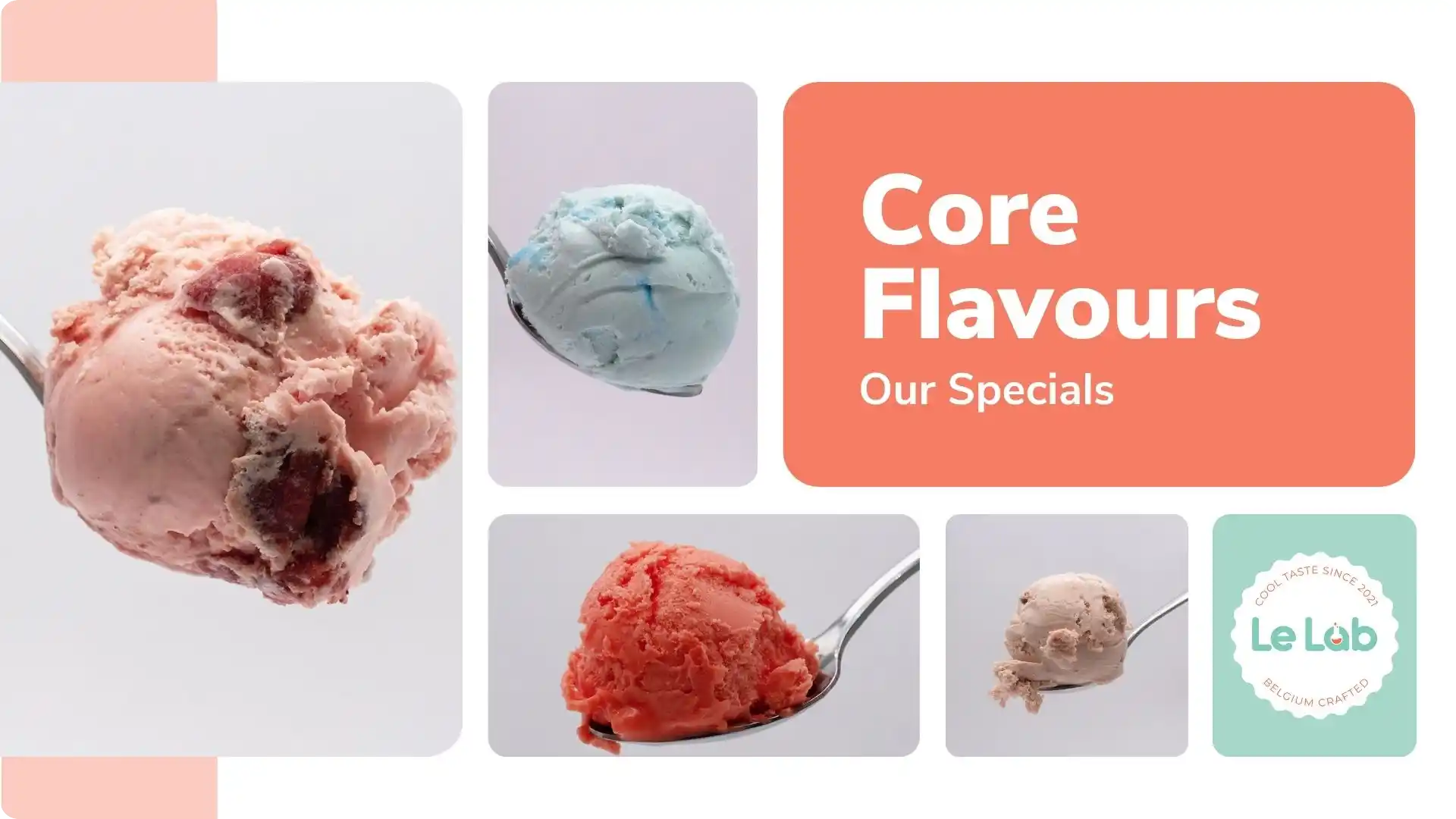
I also designed a recipe book that highlights Le Lab's unique ice cream flavors like Speculoos Buiscuits and Pineapple and Mango, one recipe for each season. The layout for each page is clean and minimalistic, with corresponding photo and cocktail pairing suggestion.

picture1

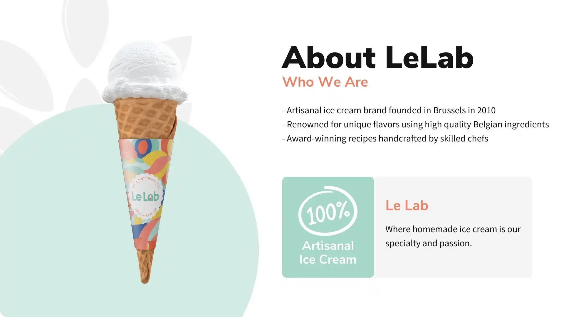
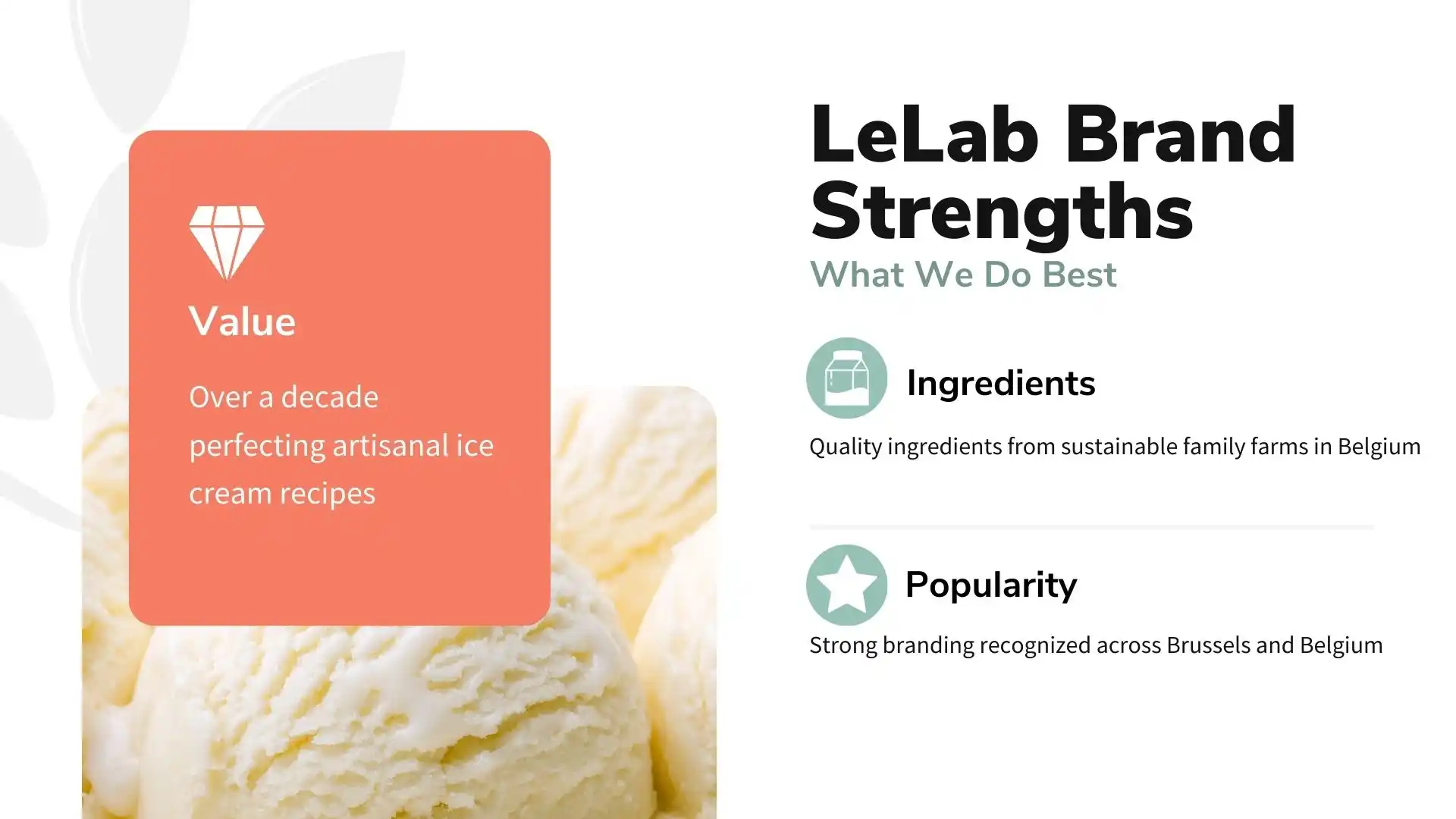
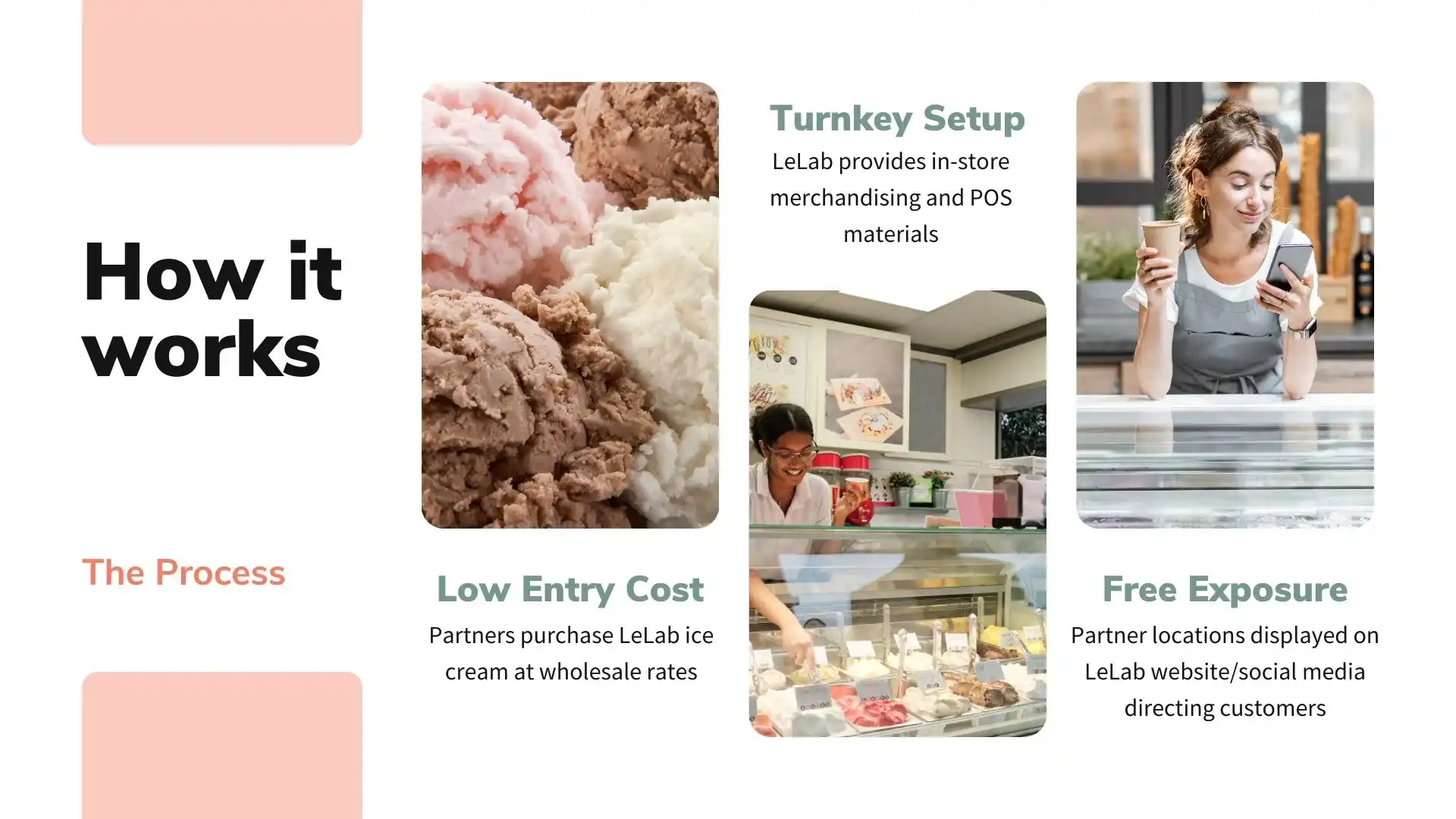
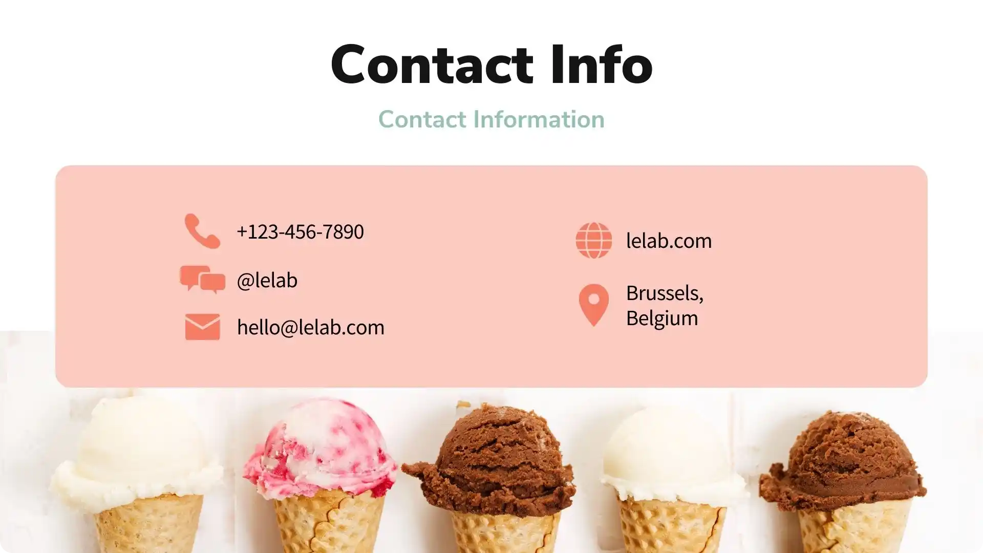
Another part of the LeLab brand identity was a custom presentation template

lelab-ppt1
lelab-ppt2
lelab-ppt3
lelab-ppt4
lelab-ppt5
lelab-ppt6
lelab-ppt7
lelab-ppt8
lelab-ppt9
lelab-ppt10

Got questions or simply want to say hello?

hello@radianachardakova.com

© Radiana Chardakova 2024